
Mapping a Fancy Racehorse
At the start of the year, I set a personal goal for myself: bike 2000 miles over the course of the year. The number was pretty arbitrary; just a big number to shoot for. In a move to keep myself accountable and have some fun with friends, I set up a betting pool around my progress, turning myself into a fancy racehorse.
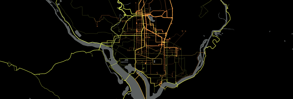
In addition to tracking my progress throughout the year, I downloaded my Strava data and created a heat map of sorts using Mapbox.js to visualize everywhere I biked in 2019. The orange lines represent rides that I tagged as commutes, while the yellow lines represent longer, more dedicated bike rides. My goal was to paint a picture of my riding habits, much like the Strava Global Heatmap, which, sure, I could’ve just signed up for Strava Summit and screenshotted their beautiful map and posted it here but where’s the fun in that? Also, this project was accomplished using free/open source tools that anyone can use to create the same results. If you are interested in seeing your own geographic data visualized in a similar way, feel free to reach out!
More detailed and technical information on this process can be found here.
In total, I spent 236 hours, 33 minutes and 11 seconds, biking 3,322 miles on 422 different rides, climbing a total of 123,101 feet over the course of the year, riding my bike at least once on 233 days. Rides that I tagged as commutes (ie. riding to work or around town) ended up accounting for just under half of my mileage at 1,599 miles with an average distance of 4.45 miles over 359 recorded rides. The other half of my mileage ended up coming from 63 recorded rides at an average of 27.4 miles each.
An Ode to Rock Creek Park
One of the things that stands out the most to me in the map is the bright, solid, curvy line that is lit up in the Northwest part of DC, which some people may recognize as Rock Creek Park. This is by far my favorite place to ride in DC. The road, which is closed to cars on the weekend, is incredibly scenic, has some great climbs and descents, and was recently re-paved. The park is also right in the heart of DC meaning that it was easy to get to for a quick ride and that I’m not stranded in the middle of nowhere if I get a flat or start to feel miserable.
If you zoom in a bit on this part of the map you can see each individual line from every ride that contributes to the larger pattern, painting a picture of just how many laps I took in Rock Creek Park over the year.

Longest Ride of the Year
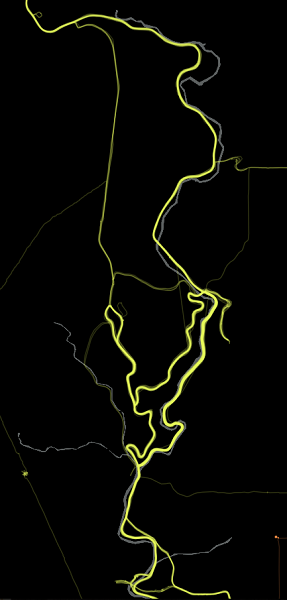
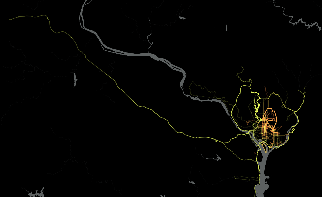
Besides biking 2,000 miles, another goal was to ride an imperial century (100 miles). I’ve ridden two in the past, but they destroyed me and my time/average pace showed some room for improvement. My route of choice is the Washington & Old Dominion trail, which offers a 100 mile round trip from DC to Purcellville, VA and back. The path is in great shape and offers tons of pit stops along the way, including a great BBQ place for much needed calories. I made a foolish attempt for the Century on one of the hottest days of the year on a mildly strained ankle in July. The failure of the first attempt has me pretty dissuaded until pretty late in the season. With the year ending, I realized I only had a small window of time left before the weather turned on me, so I gave it another shot on a November 11th. Despite a very sore butt, I ended up shaving 15 minutes off my previous best time and, better yet, didn’t feel like I was going into shock after the ride was over.
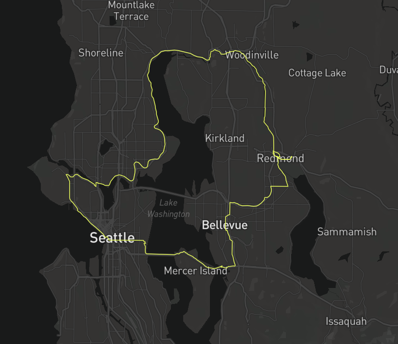
Miles Around the World
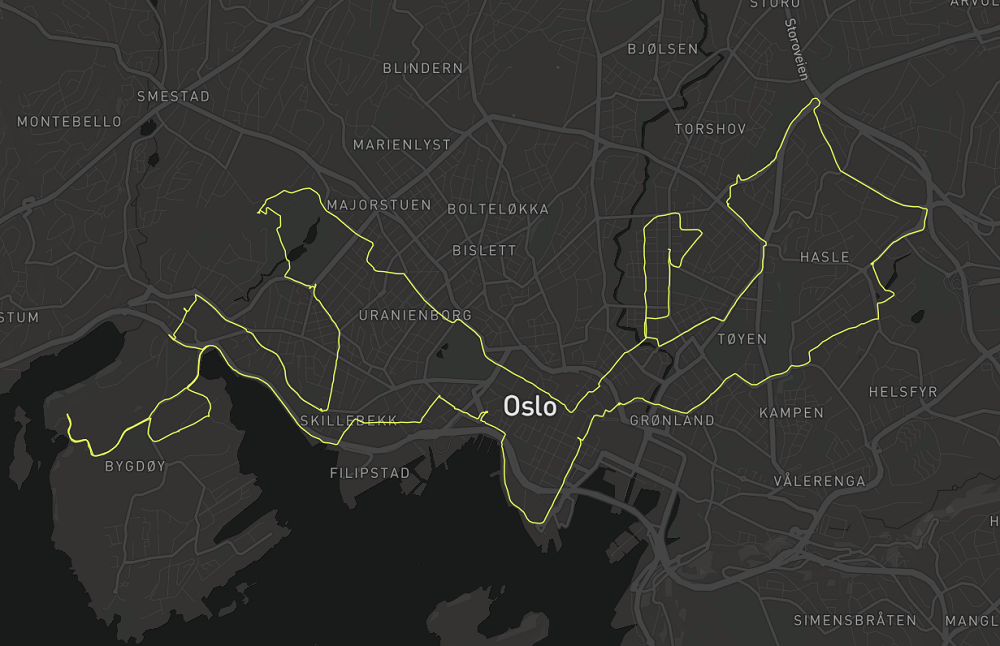
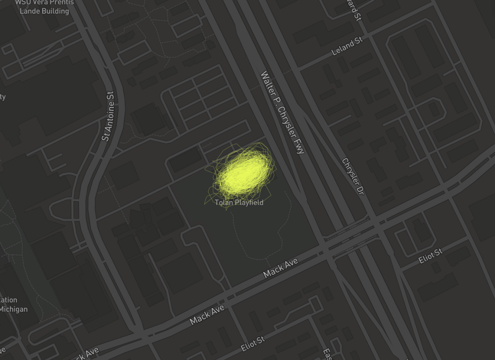
One of the things I really enjoy about this project is that it captured a number of experiences throughout the year. At the tail end of a summer trip in Europe, I found myself stranded in Oslo due to an abrupt flight cancellation. I used the day between flights to rent a tank of a city bike and explore the city. Two months later, I rented a proper road bike in Seattle without putting on any sunscreen and got absolutely roasted. Then in November, I visited the Lexus Velodrome in Detroit and rode on a track for the first time, which was terrifying but so much damn fun.
Oslo, Norway
Seattle, Washington
Lexus Velodrome - Detroit, Michigan
Further Work
There’s still a lot of work to do with this data. Strava’s API offers data on segments, which allows me to track yearly performance/improvement on specific segments that I rode multiple times. I’m still working on processing and analyzing this information and hope to have an update to this page early in the year.
Technical Details
Processing the Geographic Data
The underlying data behind the map was gathered by exporting my ride data from Strava, which provides a ton of data, including geographic data in either a .tcx or .gpx file depending on which device you use - GPX is the default format for activities recorded on my phone and TCX was the format for all of the activities recorded on my Fitbit, both are really just a different form of XML data. Because I had my heart set on creating the map in Mapbox, I knew that all the GPX/TCX data needed to be converted to GeoJSON. This was done in Python using the gpx package to handle the GPX files and xml & lxml packages to handle the TCX files - huge thanks to the vpower project for helping me understand how to parse TCX files.
Once the geographic data was processed and converted to GeoJSON, I needed to think about how the data would be stored and displayed. From a privacy standpoint, I wanted to avoid storing the raw text file on my public Github account, which would contain all of my start and end points. Fortunately, Mapbox allows users to store datasets and tilesets on their server, however there is a 5 MB limit on the filesize of GeoJSON files that can be stored. As I am displaying a year’s worth of riding, the GeoJSON file ended up being a dense 15 MB. Additionally, from a data load standpoint, using this massive GeoJSON file was suboptimal leading to poor/slow rendering even when working locally. Then, I discovered Tippecanoe, a CLI tool developed and maintained by Mapbox to create vector tilesets from GeoJSON data. Tippecanoe ended up reducing the file size to about 1 MB, which allowed me to securely store the data on the web and enabling this map to read and display the data with a fraction of the load time.
Mapping
Ironically, the mapping portion of this was probably the smallest part of the work. As I mentioned before, all of the mapping was done using Mapbox.js in JavaScript. This was mostly opted for because of the very cool work my friend and colleague, Mahkah Wu, did with the library in previous Stop & Frisk mapping. In order to paint a clearer picture of my riding habits, I created a custom minimalist map style, which removed all man-made geographic elements.