
Investigating Racial Inequity in D.C. Stop & Frisk

August Warren, Mahkah Wu, and Mika Weinstein
Key Findings
-
Black residents were the target of over 80% of forcible police stops in DC from 2010-2017. Of black residents stopped by police, 1 in 5 were under the age of 18 and 9 in 10 were male.
-
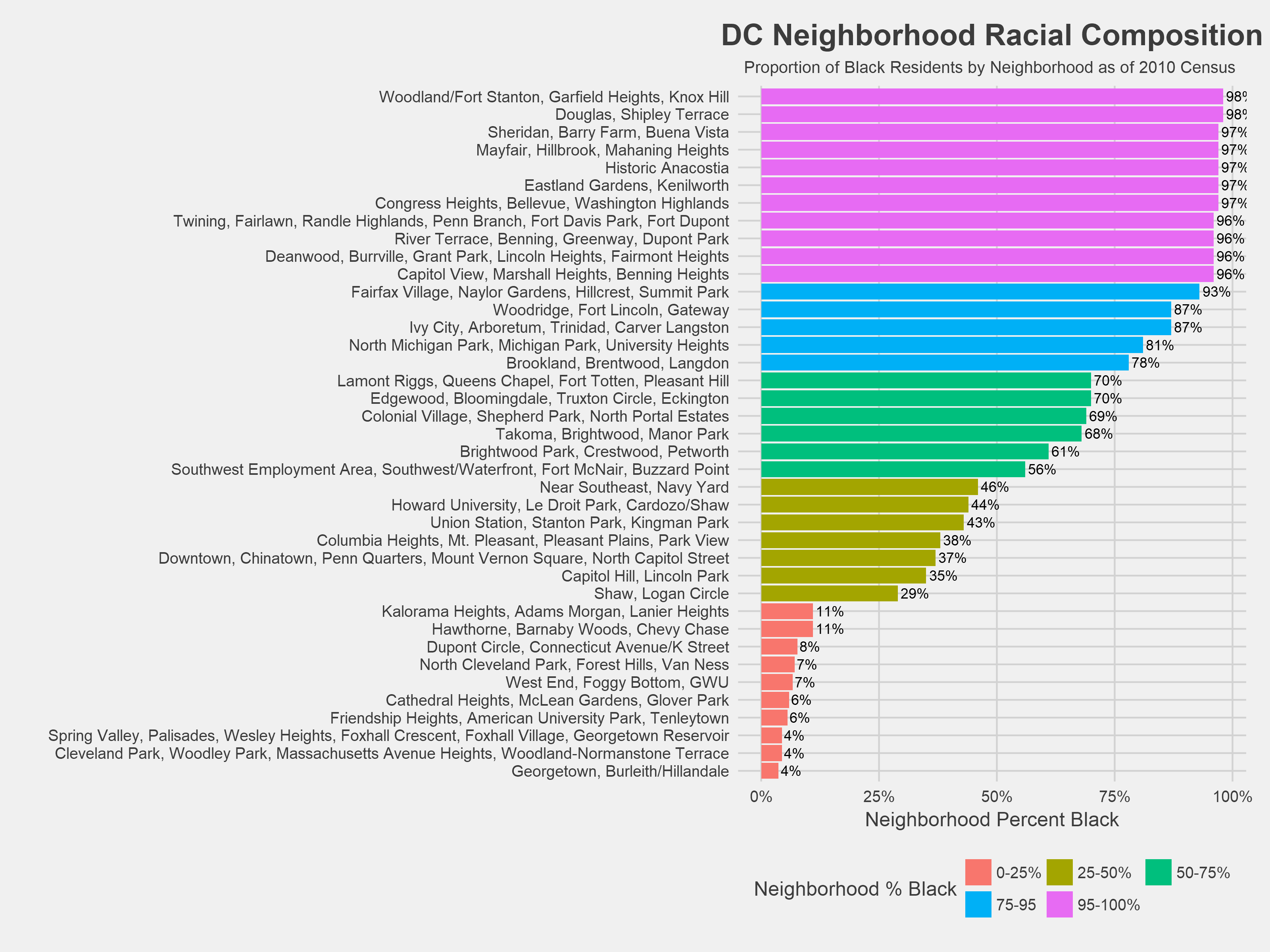
Overall, black residents were forcibly stopped by police at a rate well in excess of both the proportion of black residents living in DC and the proportion of reported crimes committed by black residents while white residents were stopped at a rate lower than the analogous population and crime proportions. Each of Washington DC’s 39 neighborhoods have distinct racial makeups, but these disproportionalities persist in nearly all neighborhoods with fewer then 95% black residents.
-
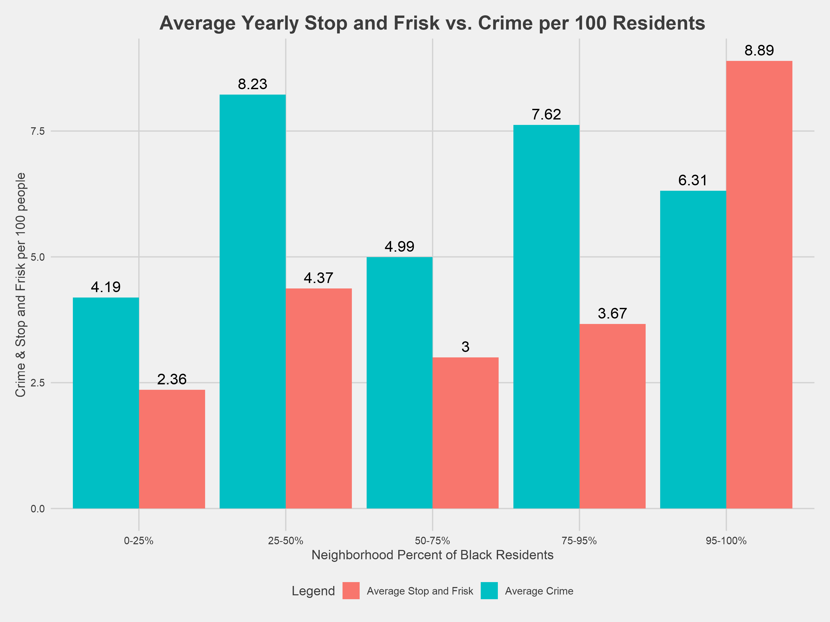
There exists a strong linear relationship between a neighborhood’s annual crime level and that neighborhood’s stop and frisk level over the subsequent year. However, neighborhoods with the highest proportion of black residents (95-100%) have, on average, ~47 more stop and frisk incidents per year compared to neighborhoods with the lowest proportion of black residents (0-25%) when crime is held constant.
-
In 2016, black and Hispanic/Latino residents were stopped at 3.91 and 4.10 times higher rates, respectively, than white residents when controlling for each racial cohort’s reported crime level across all DC neighborhoods. The rate generally increases in neighborhoods with a higher proportion of white residents.
-
This analysis includes an interactive map and neighborhood explorer application that enable users to look for trends and patterns not covered in this analysis.
Background & Introduction
A stop and frisk, or Terry stop, is an investigatory detention that police may initiate based on reasonable suspicion that the detained individual is engaged, or about to engage, in criminal conduct. In addition, police may conduct a limited search for weapons in order to protect the officer or public safety when the officer has reasonable suspicion that a stopped individual is “armed and dangerous.” While police may only initiate a frisk to search for weapons, they may seize contraband discovered during the frisk. In both cases, the standard of reasonable suspicion means that police must point to specific and articulable facts, although a set of individually innocuous facts may meet the standard for reasonable suspicion when considered together.
Named for the Supreme Court case that defined this authority, Terry v. Ohio, 392 U.S. 1 (1968), Terry stops rose to prominence through controversy over racial profiling in the New York Police Department’s (NYPD) “stop, question, and frisk” policing strategy. At its height in 2011, the NYPD made 685,724 stops; the vast majority—over 85%—of those stopped were black or Hispanic/Latino. Proponents argue that it preempts crime by allowing officers to intervene and check for illegal weapons that may be used in future crimes, while opponents argue that the law allows police officers to harass people of color with weak, or non-existent, reasonable suspicion of criminal conduct. Some research shows that the NYPD’s stops had few effects on robbery and burglary, though most research cautions against drawing definite conclusions on the impact of the NYPD’s stop and frisk program on crime.
Racial bias in the NYPD’s policing program has been studied extensively, but incident-level data on DC Metropolitan Police Department’s (MPD) use of stop and frisk was only released earlier this year. The full dataset, found here along with further documentation, spans from 2010 through 2017 and contains demographic information about the person stopped as well as the time and location of the stop.
This dataset provides some opportunity to examine policing policy in the District, but ultimately falls well short of documenting MPD’s stop and frisk to the extent required by law. In 2016, the DC City Council passed the Neighborhood Engagement Achieves Results Amendment Act of 2016, or the NEAR Act. The legislation was designed to be a “comprehensive, public health-based approach to crime prevention and intervention,” as described by its author Kenyan R. McDuffie, Council-member for Ward 5. Collecting richer data on felony crimes, stops and frisks, and use of force incidents is a key element of the law. Since 2016, the MPD has failed to comply with this provision by omitting critical data on stop and frisk incidents, including what facts justified the stop, whether a frisk was initiated, and whether an arrest was made.
Various DC advocacy organizations, including Black Lives Matter DC, Stop Police Terror Project DC, and the American Civil Liberties Union of the District of Columbia, have petitioned and submitted FOIA requests for the MPD to release this data. However, as the Washington City Paper reports, the MPD denied the initial FOIA request in 2017 because the data collection systems (required by law) had not been put in place. A year later, these organizations again requested this information and were denied for the same reason. These groups filed suit against the Mayor’s office to either release the detailed data or, if the data is truly lost, begin collecting the data, as required by law. The outcome of this litigation is pending.
DC Judiciary and Public Safety Chairman Charles Allen questioned MPD Chief Peter Newsham as to why the required data had not been collected earlier this year; Newsham stated that the MPD was “guilty” of not following the stop and frisk data collection mandate but had worked to develop other data systems prescribed by the NEAR Act. Although the Council allocated $150,000 specifically for stop and frisk data collection in fiscal year 2018, the MPD found the work of reviewing and sorting the data to be overly “laborious and costly” and did not utilize the funding. The MPD has found the resources and time to build other data systems, including those that highlight crime rather than enforcement, like DC Crime Cards.
Other cities have collected data analogous to what the NEAR Act mandates, and it has driven lots of important research, like this work on racial disparities in arrest rates. We came to this project to do similar research in DC but were confronted with a lack of detailed data. In particular, despite this policing strategy being known as “stop and frisk,” whether or not police escalated a stop to frisk was one of the mandated fields omitted by the MPD.
The available data did allow us to explore the following research questions: 1) Who is being stopped and frisked by the MPD? 2) How does the stop and frisk population compare to the overall population in DC? 3) Are different groups of people being disproportionally targeted by stop and frisk, and if so, by how much and where?
Along with the stop and frisk data, the MPD also reported on “field contact reports” from 2012 to 2017. According to the documentation, a field contact is a non-forcible stop and/or questioning between MPD and a citizen, although it is unclear whether citizens stopped non-forcibly know they do not need to speak with police. Forcible contacts make up the lion’s share of all interactions, accounting for more than 28,000 incidents over the five years data was collected, compared to about 11,000 non-forcible stops. This analysis primarily focuses on forcible stops, but some examination of non-forcible stops is presented in the appendix.
This a living piece of research that attempts to provide a sense of understanding of a very complex social issue, and we are open to new ideas and viewpoints that we might have missed. We will follow the ongoing litigation against the MPD and the Mayor’s office and update the work below if further data is provided.
Stop and Frisk: Overview
In order to get a sense of the data, we’ll start by looking at some descriptive statistics, specifically who was and stopped and where stops took place. WUSA9’s special report on stop and frisks found similar patterns in the descriptive statistics. They complemented these conclusions with interviews highlighting the human side of the issue. We will delve deeper into the quantitative side of things.
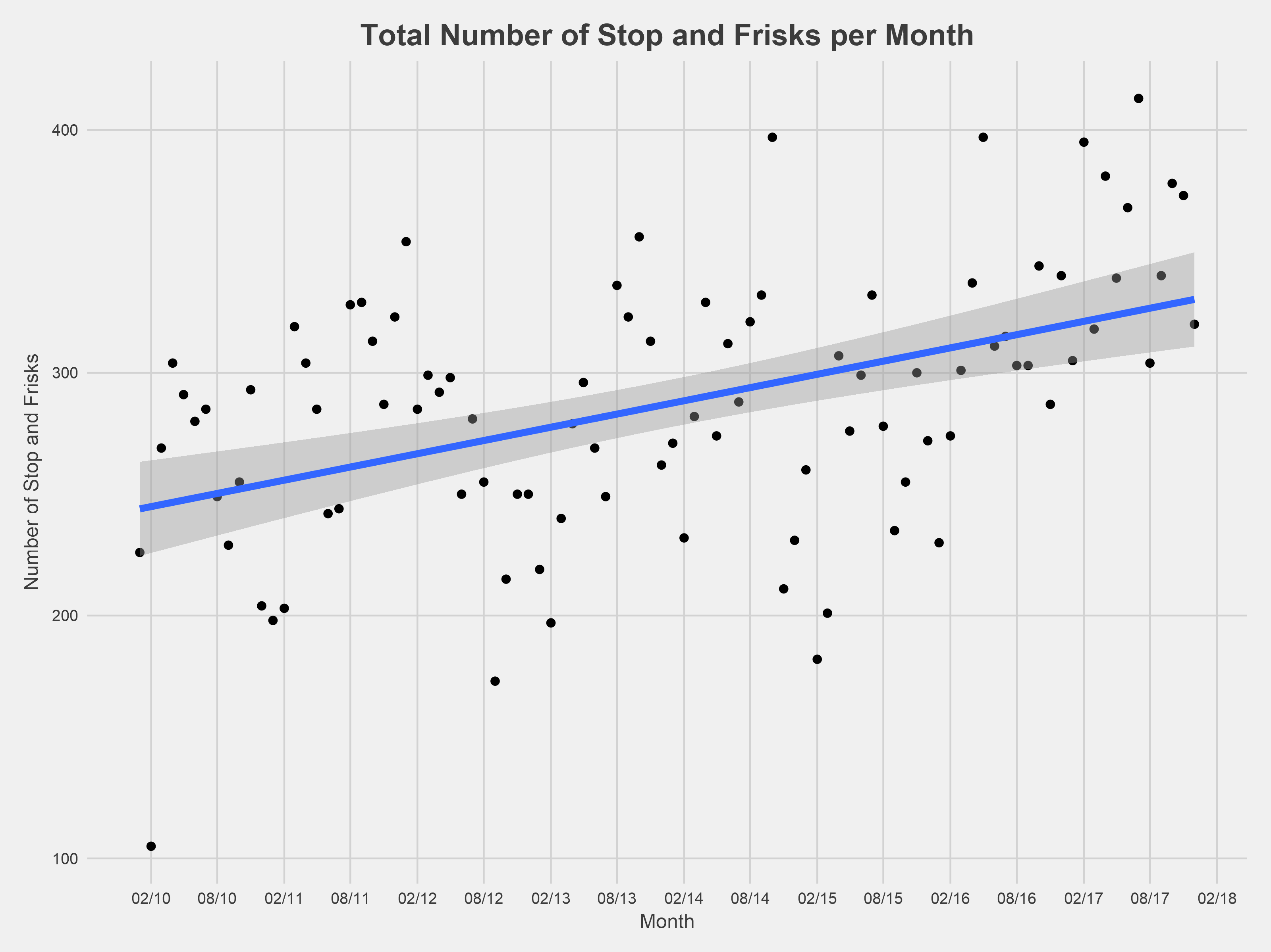
The number of monthly stop and frisk incidents generally has increased since the MPD started collecting and reporting data in 2010. Interestingly, there was a noticeable drop in incidents near the end of 2014. However, since that initial drop, there has been a rapid increase in monthly stop and frisk incidents across the city, peaking in the summer of 2017.
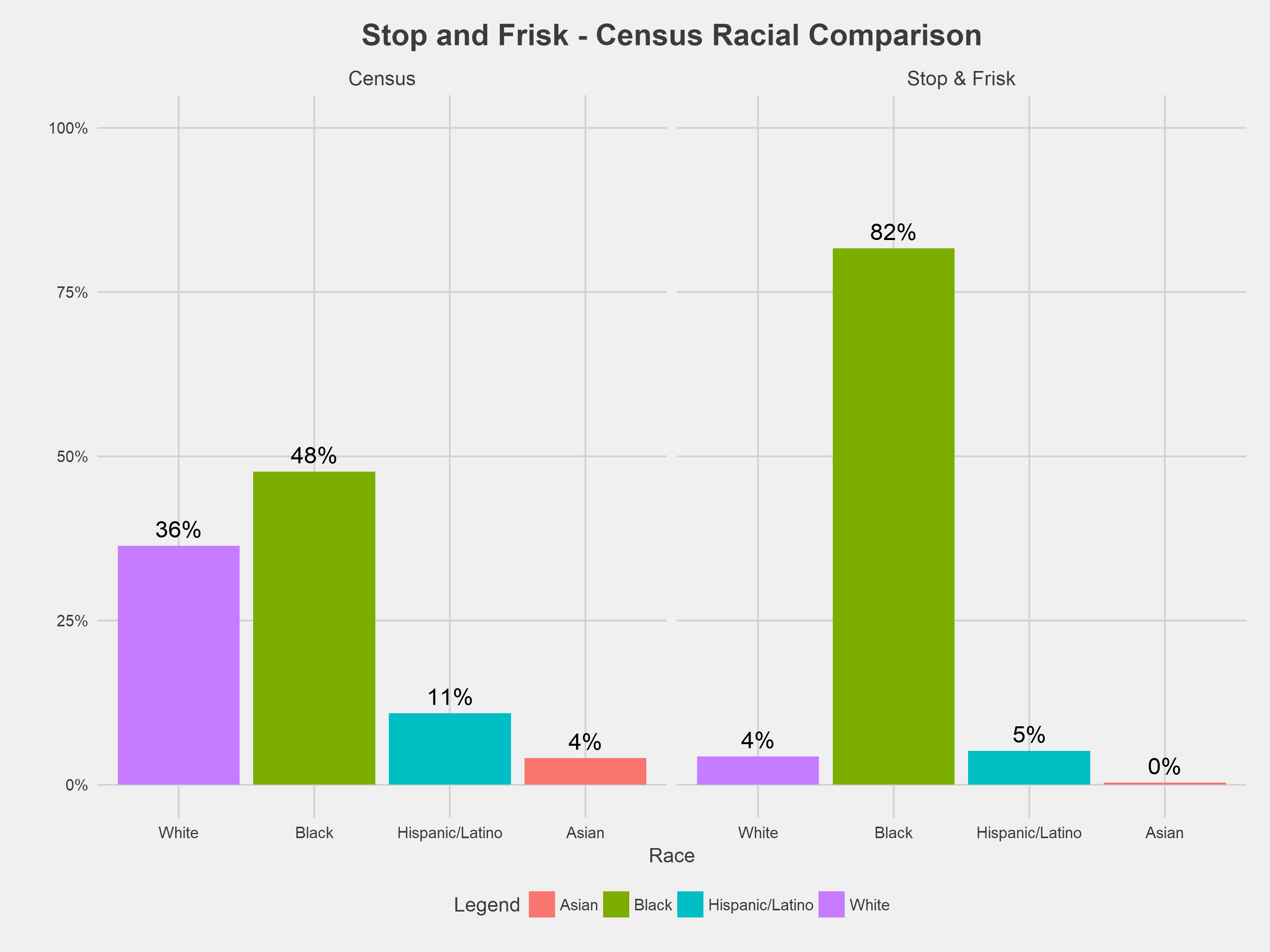
Overall, the vast majority of incidents targeted people of color, specifically black people. Between 2010 and 2017, ~80% of all stop and frisk incidents involved black residents, while black residents account for ~48% of the DC population, as of the last decennial census in 2010.
Quantifying race and ethnicity has some inherent limitations. The stop and frisk dataset includes fields for both race and Hispanic/Latino ethnicity. For this analysis, we combined both fields by categorizing anyone listed as being of Hispanic/Latino ethnicity as Hispanic/Latino in a combined race/ethnicity field. Certain racial/ethnic groups such as Asian and people classified as “Unknown” in the police report represent a very small portion of the overall population and in order to not draw misleading statistical conclusions from a very small subgroup, they were dropped from subsequent analysis.
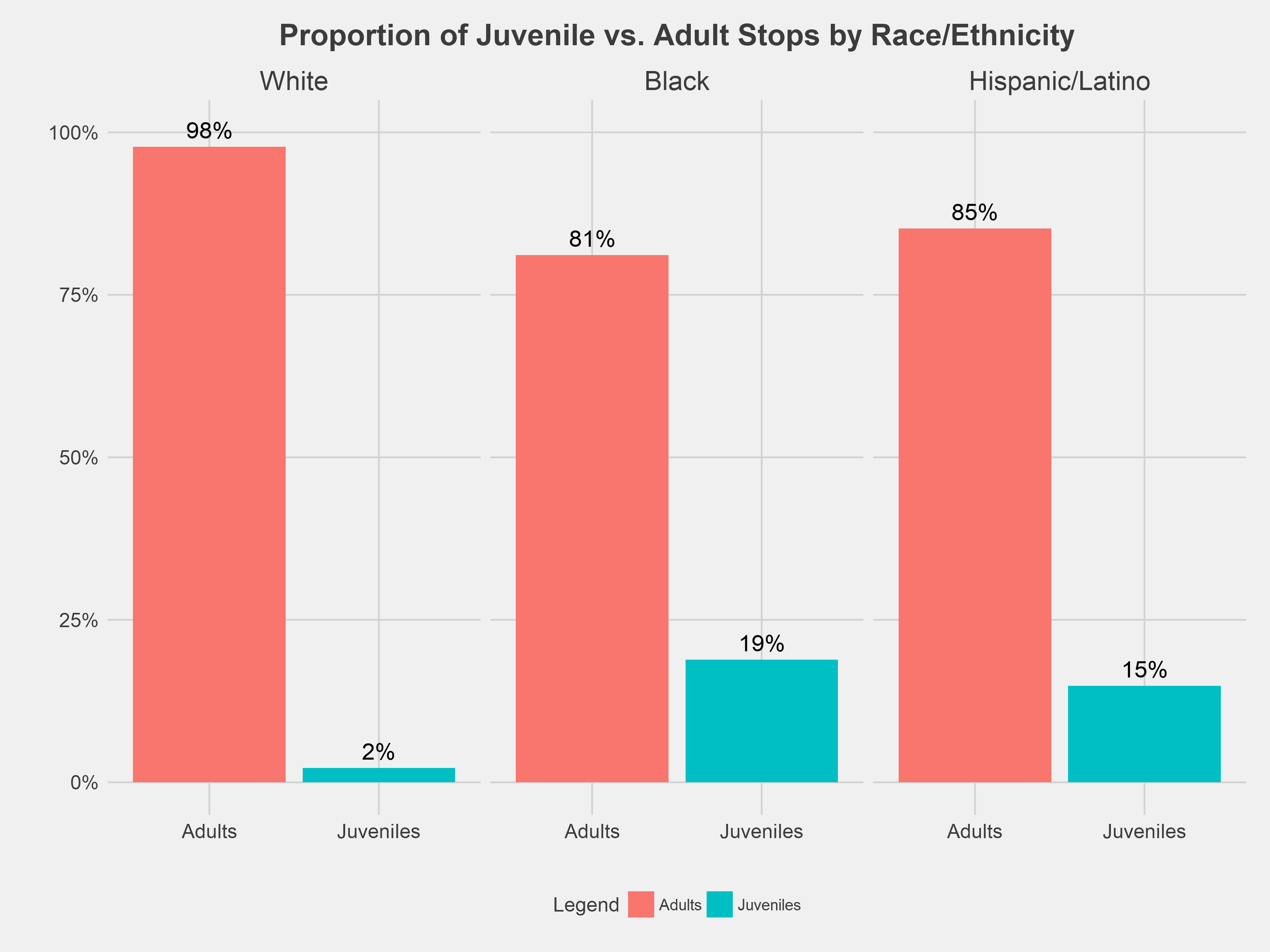
Racial disparity in police stops are particularly striking among children. Nearly 1 in 5 black residents stopped from 2010-2017 were children, compared to 2% among whites. Other research suggests a possible driver of this disparity: police tend to overestimate the age of black and Hispanic/Latino juvenile felony suspects by an average of 4.59 years while underestimating the age of white juvenile suspects by 0.86 years.
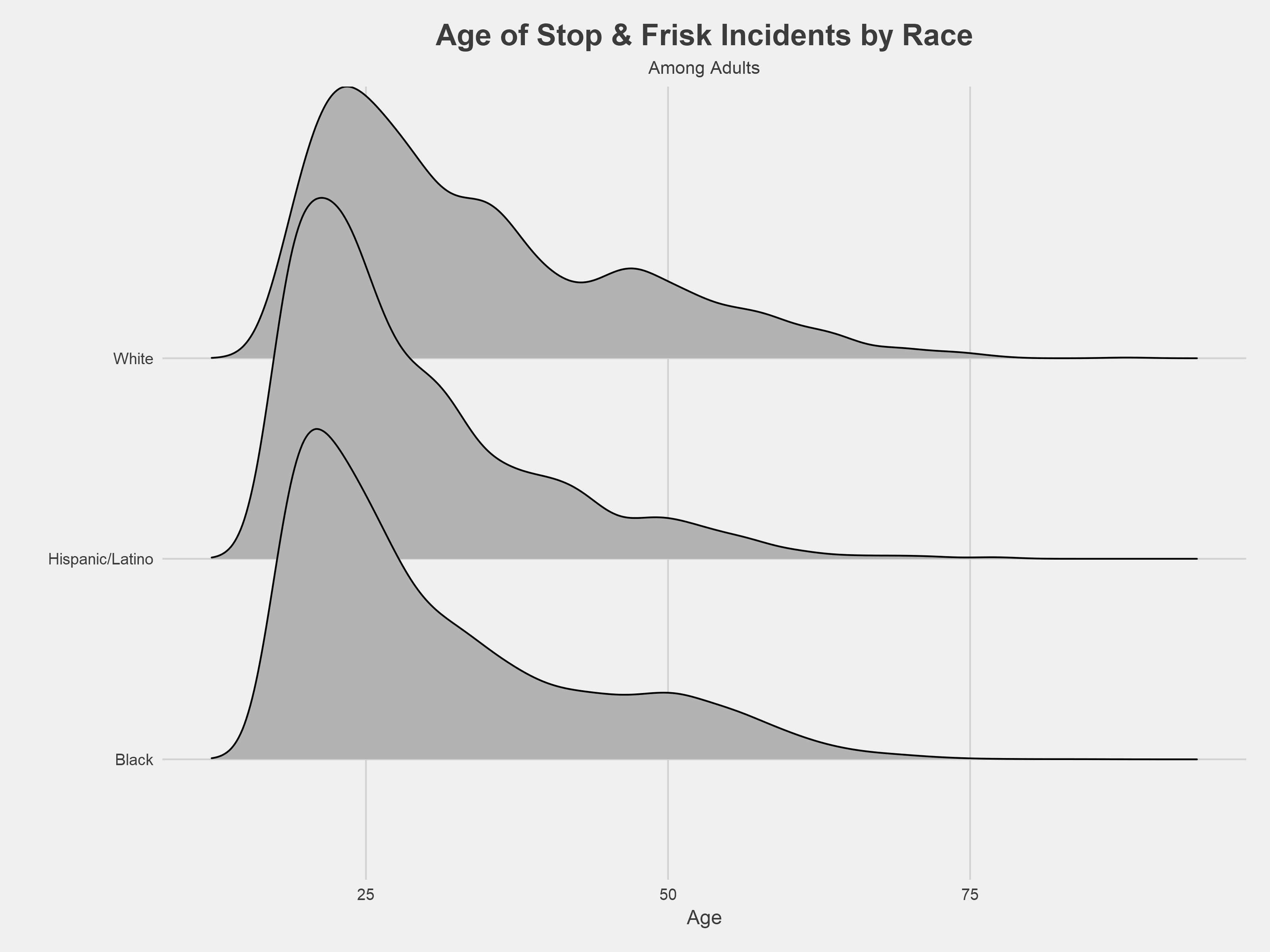
Reflecting the disparity among juveniles, black and Hispanic/Latino adults stopped by police skewed younger than white adults stopped by police. The graph above shows the overall distribution of adults stopped by police by race/ethnicity. Stop and frisk incident counts peak at 18 for black and Hispanic/Latino residents and at 23 for white residents. The median age of black and Hispanic/Latino adults stopped by police is 27, compared to 30 for whites.
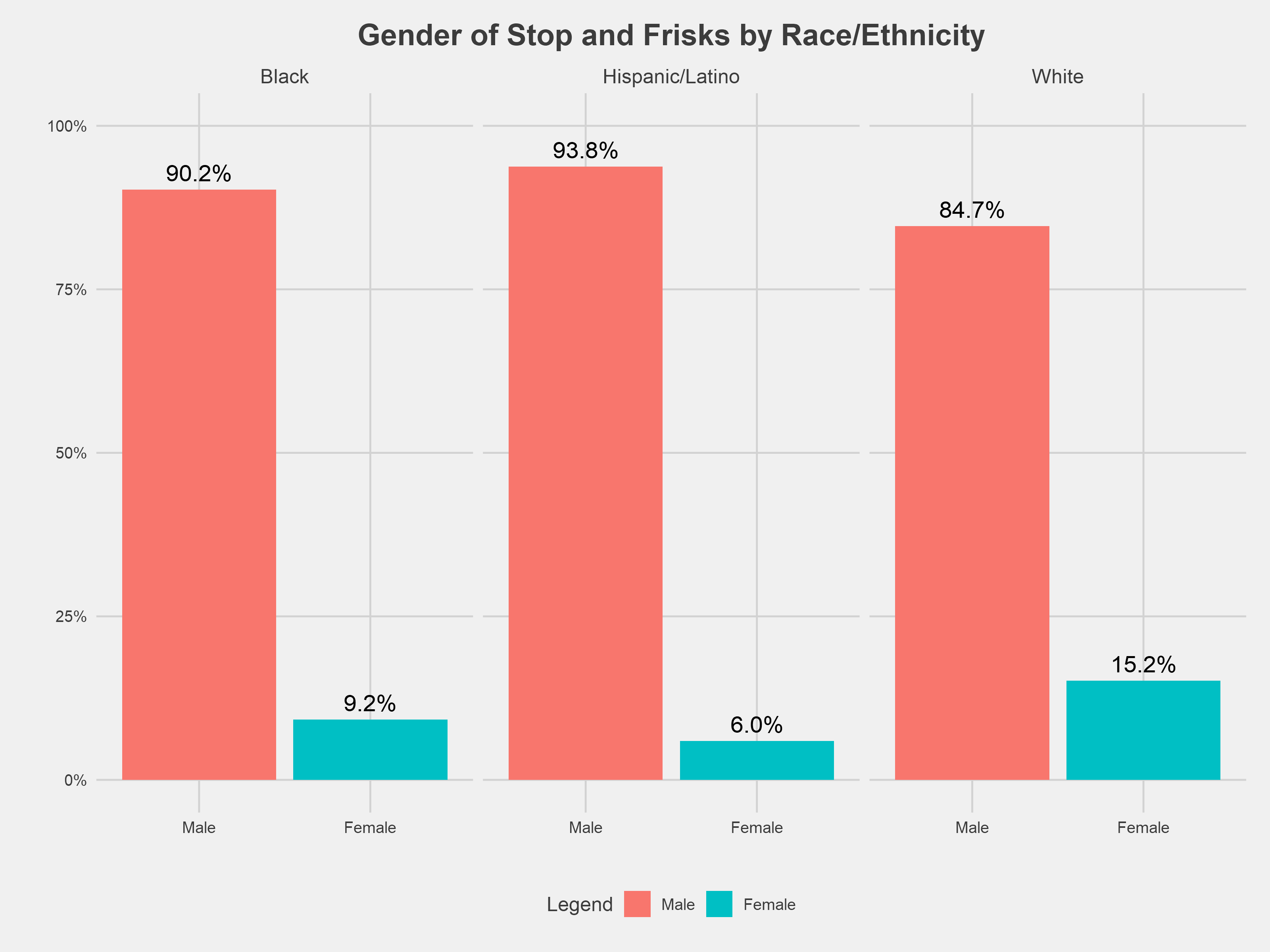
Across racial lines, police overwhelmingly stopped male residents. The gender disparity was slightly less pronounced among stops involving white residents. However, because stops overwhelmingly involved black residents, the number of stops involving black women was much greater then the number of stops involving white women. We explored the gender gap by age and found the gender distribution among black and Hispanic/Latino children to be nearly identical to the distribution among black and Hispanic/Latino adults.
We were able to geocode ~96% of the stop and frisk incidents¹, which are shown in the interactive map above. The map enables filtering by race, gender, age, and type of stop. Choropleth layers for ward, neighborhood clusters, police sector, police service area, and census tract are also toggleable. The geocoded dataset is available here.
Stop and Frisk: Neighborhood Overview
For the remainder of the analysis, we will use DC’s 39 neighborhood clusters as the unit for analysis and comparison. This interactive visualization lets users dig into the demographic profiles of each neighborhood, which we’ll explore in more depth shortly.
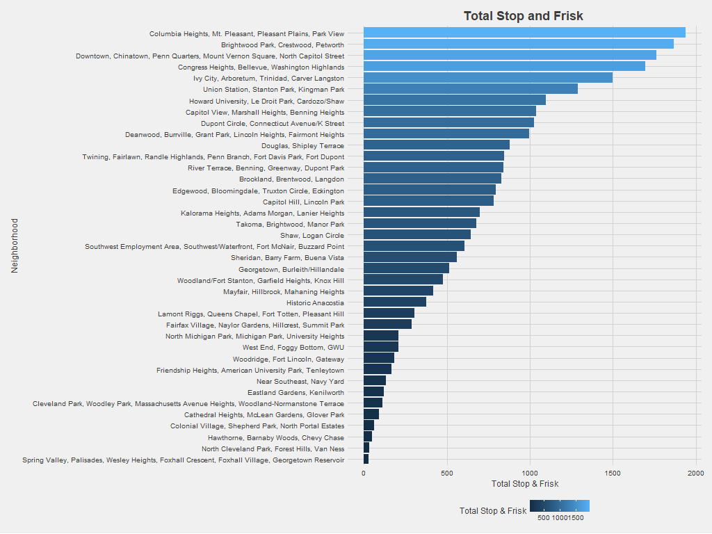
Since 2010, neighborhood clusters containing Petworth, Columbia Heights, Congress Heights, and Chinatown have experienced the most stop and frisk incidents among DC neighborhood clusters. To make sure the analysis wasn’t simply measuring neighborhood population density, the graph also shows the number of stop and frisk incidents divided by the neighborhood population (again using the 2010 census).
Adjusting for neighborhood population leads to some big changes in stop and frisk patterns. Clusters containing Columbia Heights, Petworth, and Congress Heights no longer stand out, while neighborhoods like Historic Anacostia and Brookland/Brentwood/Langdon become more prominent. Census population in DC doesn’t capture that some neighborhoods become more populated during business or nighttime hours but have comparatively small residential populations. Neighborhoods like Chinatown draw significant traffic, so the graph above likely overestimates the stop and frisk incidents per person in these neighborhoods.
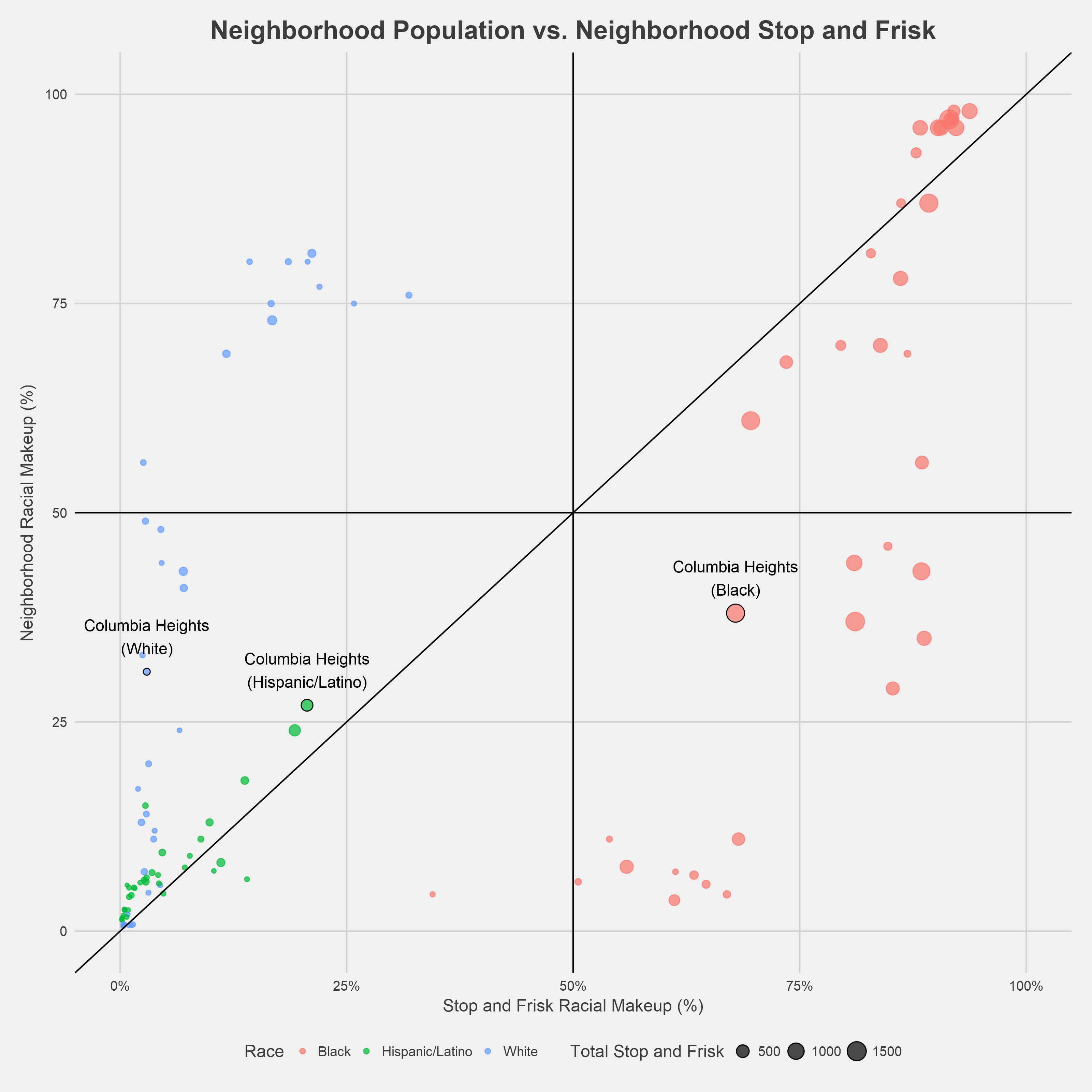
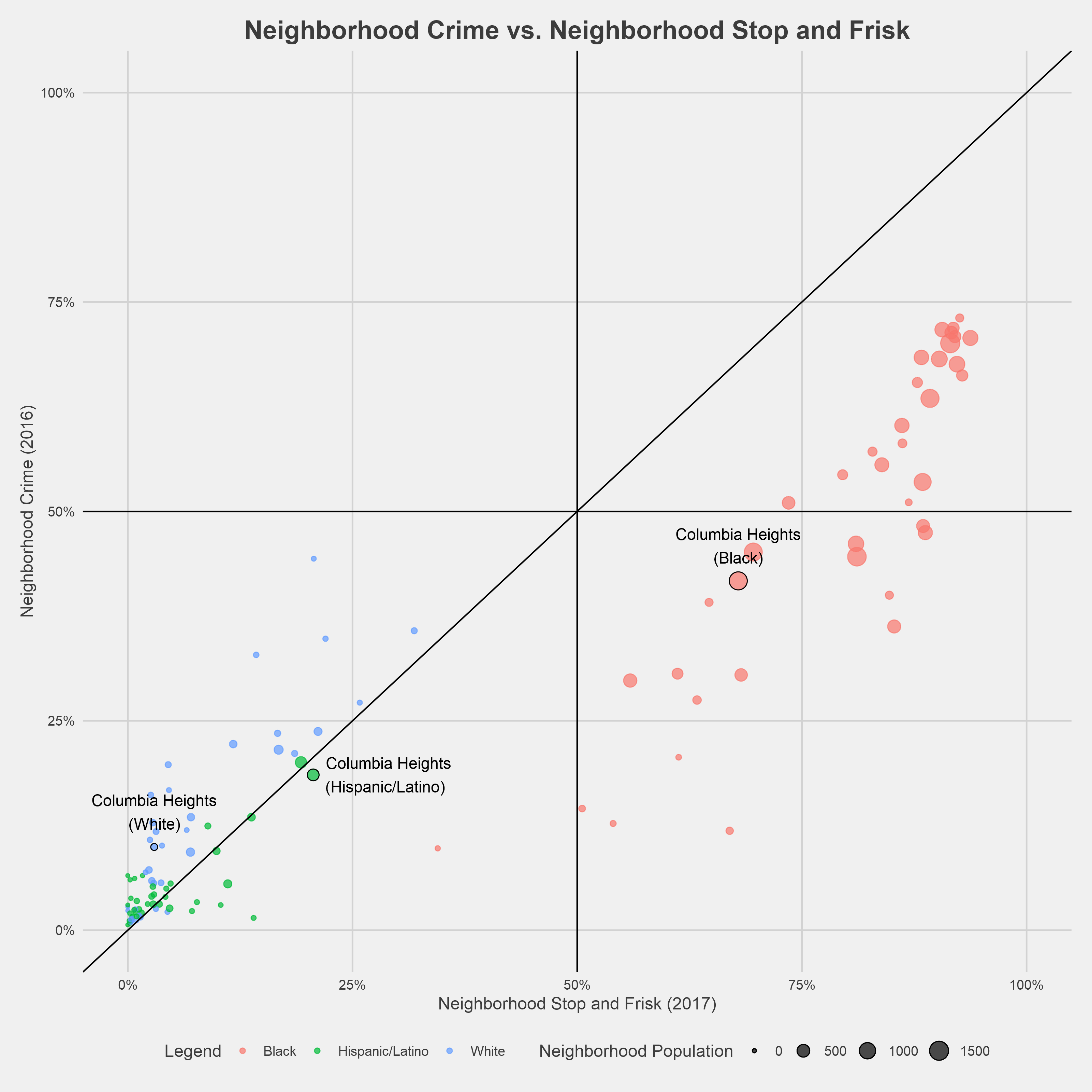
The figure above compares the proportion of stop and frisk incidents to the proportion of population for each neighborhood and racial group. The intent is to identify disproportionality in stop and frisk at a neighborhood level—whether certain racial groups are stopped at a greater rate than their actual representation in a neighborhood. Each dot represents a racial group in a given neighborhood. If the dot is below the diagonal line, then that racial group is stopped at a disproportionate rate relative to the residential population. The dots are sized by the total number of incidents from 2010 to 2017. The points corresponding to Columbia Heights are labeled above, but raw data for all neighborhoods is presented in the appendix.
There are a few clusters among the neighborhood points for black residents. The cluster at the bottom of the plot corresponds to neighborhoods where less than 10% of residents are black but where more than 50% of those stopped are black. Another cluster, including Columbia Heights, exists at neighborhoods where 25-50% of residents are black, but black residents are targeted in 60-90% of stop and frisk incidents.
Neighborhood points for Hispanic/Latino residents generally fall along the reference line—population and stop and frisk rates are roughly equal. Regardless of neighborhood composition, white residents make up less than 25% of stop and frisk incidents in nearly all neighborhoods.
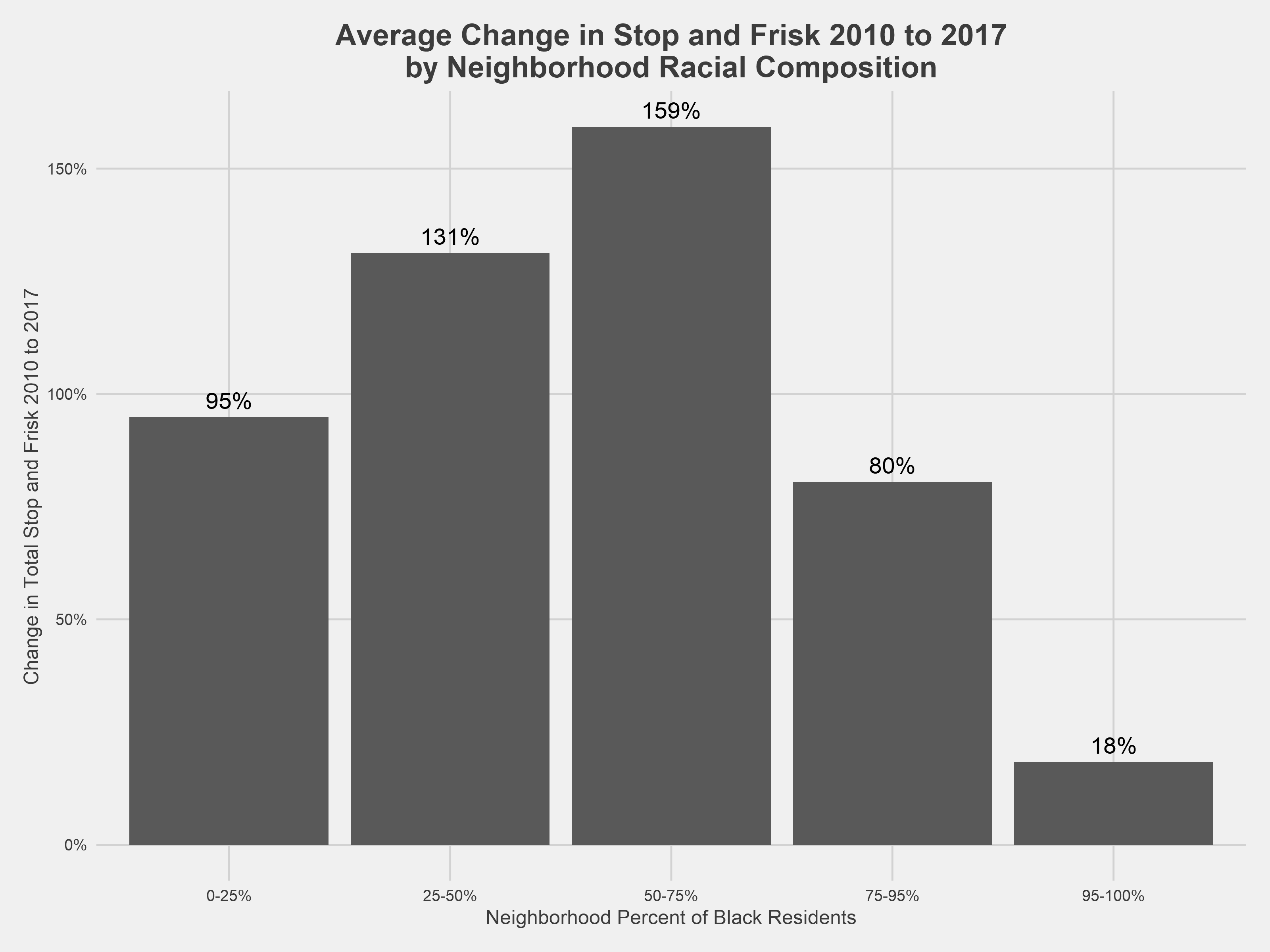
Across DC, the yearly count of stop and frisk incidents rose 42% from 2010 to 2017, but these changes were not evenly divided among the city’s neighborhoods. The more racially diverse DC neighborhoods saw the greatest increases in stop and frisk. Stop and frisk rose, on average, over 130% in neighborhoods comprised of 25-75% black residents, which includes the rapidly gentrifying neighborhoods of Shaw, Bloomingdale, Columbia Heights, and Petworth, from 2010 to 2017. While the number of stop and frisk incidents in neighborhoods with 95-100% black residents remained relatively stable from 2010 to 2017, these neighborhoods were among those with the highest rate of stops per person.
The above figure groups neighborhoods according to the portion of black residents in each neighborhood in order to compare trends across neighborhoods with different racial compositions. These bins were chosen based on the distribution of black neighborhood population and are used in subsequent analysis².
The Relationship Between Crime and Stop and Frisk
For the remainder of this analysis, it’s important to keep the words of Hadley Wickham in mind:
The goal of a model is not to uncover truth, but to discover a simple approximation that is still useful.
The descriptive statistics have so far suggested racial biases in stop and frisk practices. Over 80% of those stopped were black, and within nearly all neighborhoods, the rate of stops for black residents is higher than their neighborhood representation. However, stop and frisk advocates might counter that enforcement focuses on where crimes are being committed, and any disproportionality is incidental to that. The models in the following sections explore the degree to which the disproportionality can be ascribed to differences in crime rates. While this model is useful for demonstrating that bias exists beyond crime rates, we do not believe that a higher crime rate among particular groups warrants overpolicing their communities or profiling individuals.
Crime is more complex than available data captures, so some caveats are required. Crime rates used here only include reported crime. The Bureau of Justice Statistics estimates that over 3 million—or 52%—of all violent crimes went unreported nationally from 2006-2010. There are myriad social reasons why reported crimes might vary from the actual number of crimes committed, such as fear of not being believed or taken seriously and fear of reprisal. Criminal statistics are also highly prone to the observer effect: as a community is increasingly surveilled and subject to forcible contacts by the police, more crime may be reported to or observed by police.
We used reported crime data collected during the same time period as the stop and frisk data provided by the MPD, again retrieved through OpenData DC.
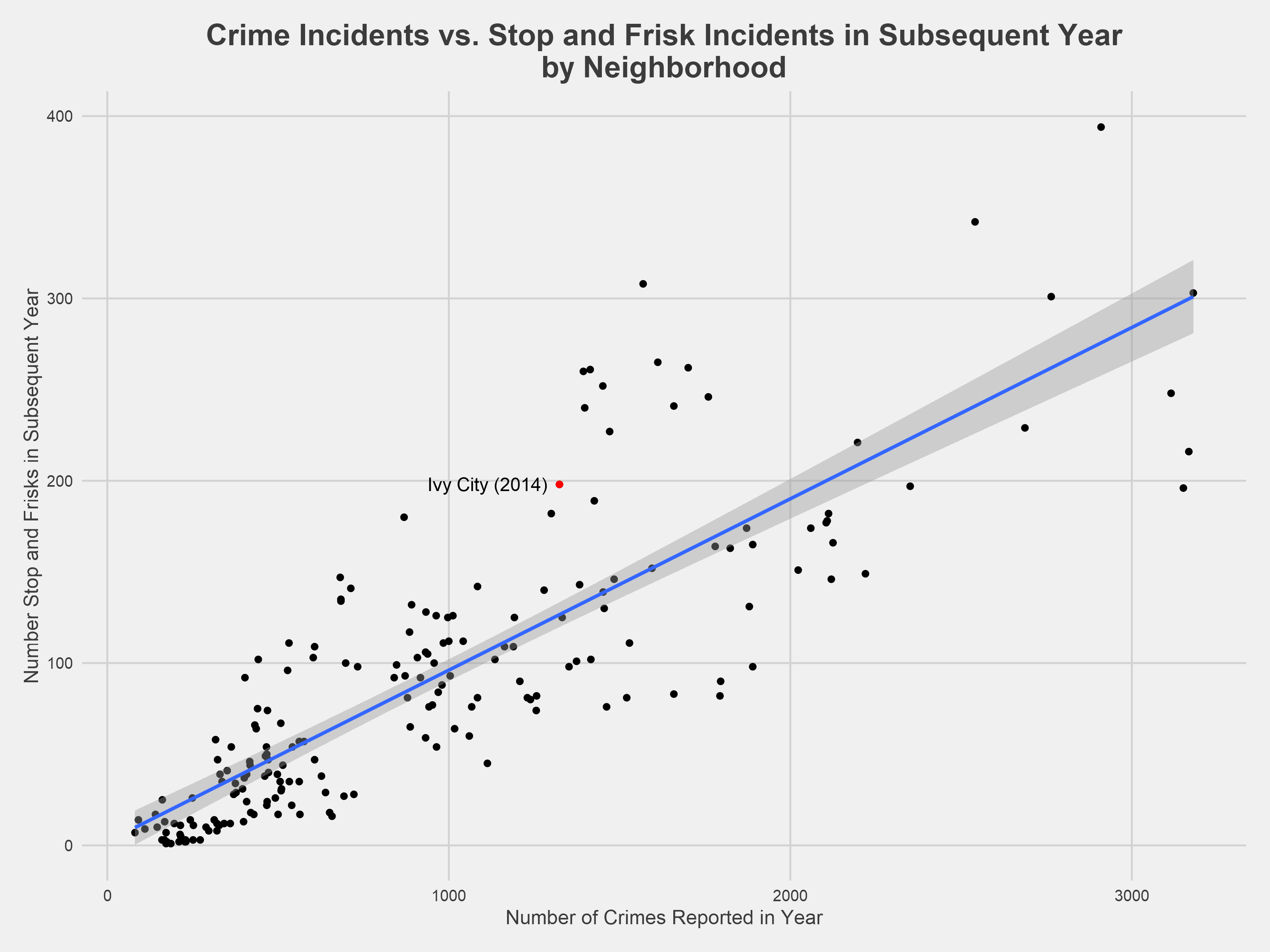
The chart above illustrates a relatively linear relationship between a given year’s reported crime level and the subsequent year’s number of stop and frisk incidents in each neighborhood of DC. Ivy City in 2014 is labeled as an example above. Predicting stop and frisk incidents with only the previous year’s reported crime data results in the blue line above³.
There are many confounding variables that influence crime and policing behavior not being considered in this simplistic approach, but this “crime-only” model shows a relatively strong relationship between a given year’s reported crime level and the subsequent year’s stop and frisk level with an R-squared of about .81. It predicts that, if 100 more crimes are committed in a particular neighborhood then are committed in another neighborhood over the course of a year, then that neighborhood will have nine more stop and frisk incidents over the course of the following year. The full model parameters are shown below (because 2010 census data must be used for all points, neighborhood values were averaged across all years):
| Dependent variable: | |
| Number of stops in subsequent year | |
| Number of reported crimes | 0.094*** |
| (0.007) | |
| Constant | -0.469 |
| (8.602) | |
| Observations | 39 |
| R2 | 0.814 |
| Adjusted R2 | 0.809 |
| Residual Std. Error | 31.901 (df = 37) |
| F Statistic | 161.745*** (df = 1; 37) |
| Note: | * p<0.1; ** p<0.05; *** p<0.01 |
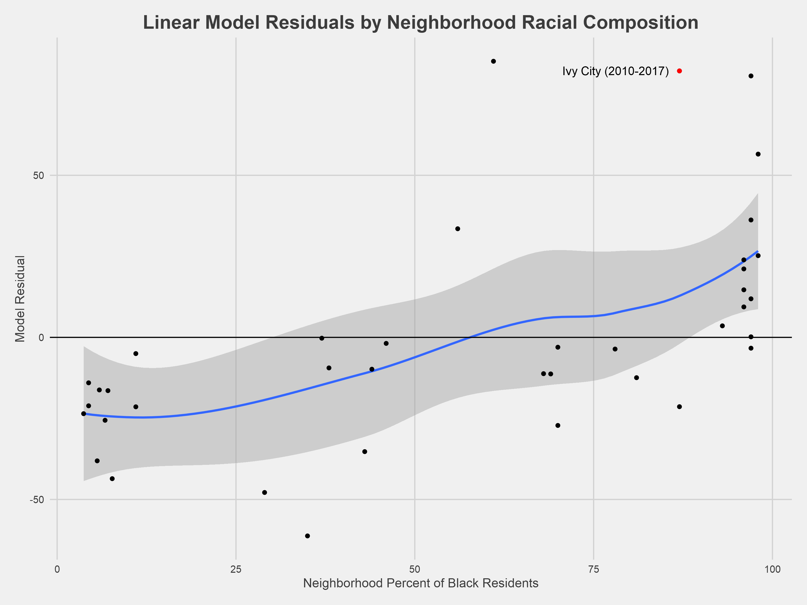
We can use this model to predict the level of stop and frisk in any given neighborhood based on the previous year’s crime data and then validate the model’s performance against the actual stop and frisk numbers. This is accomplished using the residual—how many stop and frisk incidents the model predicted minus how many actually occurred. The chart above plots the model residuals by the neighborhood proportion of black residents.
When viewed through a racial context, this approach to modeling stop and frisk appears to have its limits; it generally overpredicts the number of stop and frisk incidents in whiter neighborhoods and underpredicts the number of incidents in neighborhoods with higher concentrations of black residents. If police were solely to use crime as a decision-making data point then we would expect to see equal distribution of residuals across all neighborhoods. This indicates that there is something else driving the relationship between stop and frisk and reported crime (and it might have something to do with race). Bearing this in mind⁴, we can update the model to consider the proportion of black residents in each neighborhood.
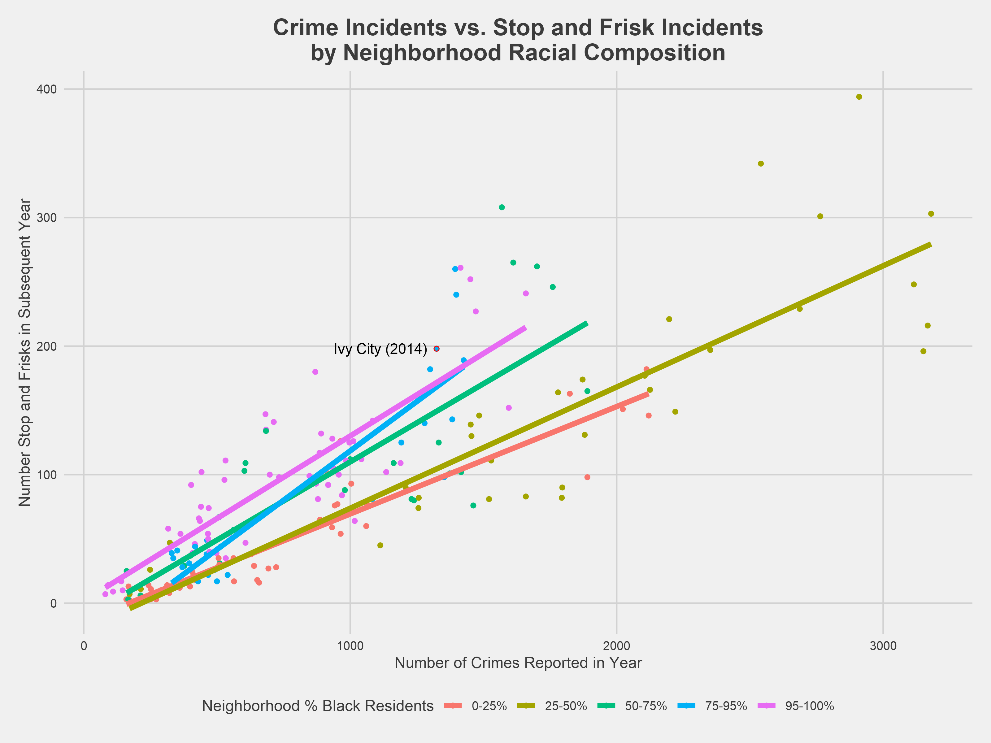
The plot above shows the same linear relationship between a given year’s reported crime numbers and the subsequent year’s stop and frisk numbers, now controlling for the neighborhood’s racial composition. Each line estimates the number of stop and frisk incidents in the following year for a neighborhood with a proportion of black residents in the given range. Outputs from the crime and race linear model are shown below alongside the crime-only model outputs.
The regression⁵ shows a fairly similar overall relationship between reported crime and stop and frisk, but it also indicates there is a statistically significant difference between the amount of stop and frisk in neighborhoods with a majority of black residents. As the model and the plot both show, neighborhoods with a majority of black residents have greater stop and frisk rates than neighborhoods with the lowest proportion of black residents and a comparable level of crime. Specifically, neighborhoods comprised of over 95% black residents had an average of 46.6 more stop and frisk incidents per year compared to neighborhoods comprised of fewer then 25% black residents. This comparison is statistically significant at 99% confidence interval.
| Dependent variable: | ||
| Number of stops in subsequent year | ||
| Crime-Only Model | Crime and Race Model | |
| Number of reported crimes | 0.096*** | 0.108*** |
| (0.008) | (0.008) | |
| Neighborhood Percent Black: 25% - 50% | -15.095 | |
| (16.253) | ||
| Neighborhood Percent Black: 50% - 75% | 30.527** | |
| (14.260) | ||
| Neighborhood Percent Black: 75% - 95% | 30.584** | |
| (15.021) | ||
| Neighborhood Percent Black: 95% - 100% | 46.644*** | |
| (11.971) | ||
| Constant | 0.317 | -30.090*** |
| (9.255) | (10.070) | |
| Observations | 39 | 39 |
| R2 | 0.796 | 0.885 |
| Adjusted R2 | 0.791 | 0.867 |
| Residual Std. Error | 34.323 (df = 37) | 27.359 (df = 33) |
| F Statistic | 144.733*** (df = 1; 37) | 50.605*** (df = 5; 33) |
| Note: | *p<0.1; **p<0.05; ***p<0.01 | |
The Benefit (and lack thereof) of the Doubt: Reintroducing Race
While the previous section demonstrated neighborhood level racial bias, these models do not take into account the race of the individual involved in either the crime or the stop and frisk incident. Most available DC crime data is stripped of the assailant’s demographic data. However, the MPD released 2016 felony crime data that includes the race of the assailant. This enables us to add another dimension to the previous section’s analysis: rather than comparing the total crime to total stop and frisk for each neighborhood, we can compare a specific racial group’s crime rate to that racial group’s stop and frisk. This is one avenue to attempt to quantify overpolicing. This section examines the extent to which stop and frisk rates exceed the reported crime rate for various racial groups, but only for a single year.
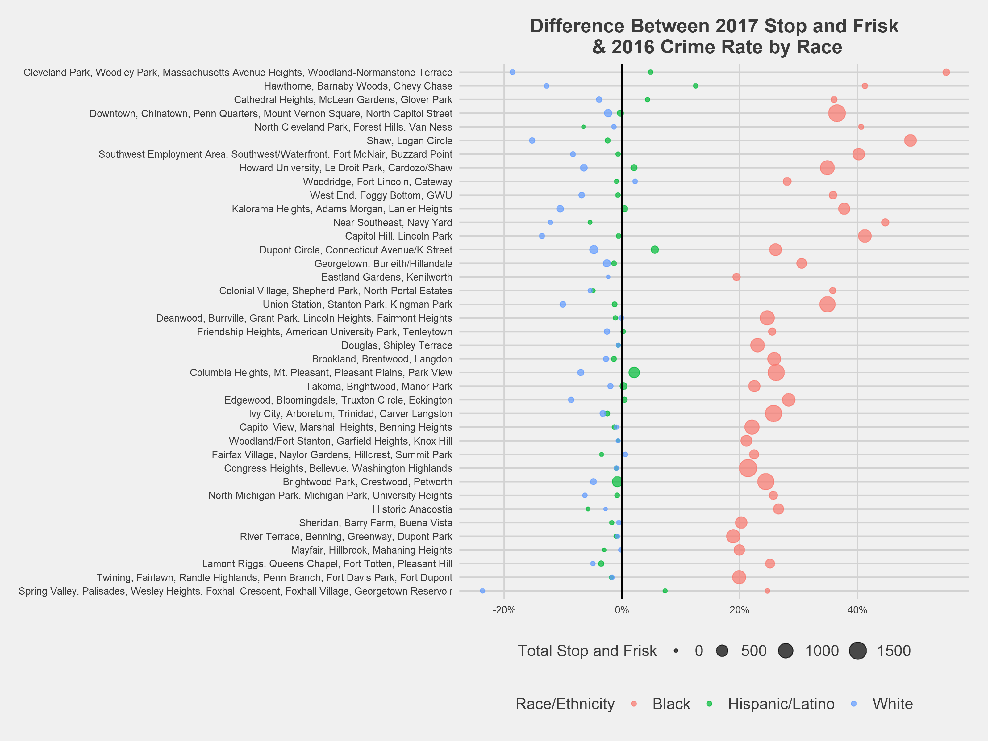
The figure above shows the difference between a racial cohort’s rate of stop and frisk and that racial cohort’s reported crime rate for each DC neighborhood cluster⁶. For example, in Capitol Hill/Lincoln Park, black residents account for 89% of stops and only 47% of reported crime, resulting in a rounded difference of 41%. Across all neighborhoods, black residents are stopped at a higher rate than their racial group accounts for in the overall neighborhood reported crime rate. On average, black residents are targeted for stops at a ~30% higher rate than their reported crime rate. Likewise, the stop and frisk rate is lower than the reported crime rate among whites across the majority of DC neighborhoods, with a reported crime rate 5% higher than the stop and frisk rate. The neighborhood clusters containing Cleveland Park, Chinatown, and Shaw have the greatest disproportionality between black and white residents.
Turning again to modeling, we can add the demographic reported crime data to the crime and race model used previously. Instead of using overall neighborhood level reported crime data, this model incorporates reported crime levels by racial group. This work is built off the research conducted by Gelman, Fagan and Kiss (2007) examining stop and frisks in New York City. It utilizes a Poisson regression, a variation on the linear regression used previously⁷.
The other difference from the previous model is that we’re predicting the ratio of stop and frisks per reported crime, rather than the number of stop and frisk incidents. This might seem like a significant change, but it results in a situation that’s almost identical mathematically: Using logarithm rules, we can split the ratio apart and treat crime as an additional linear term. This term “offsets” the model’s constant term according to the crime level, and the regression can once again be expressed as a prediction of the number of stop and frisk incidents.
The model parameters are shown below, and a plot of its output follows.
| Dependent variable: | |
| Stop and Frisk | |
| Race: Black | 1.363*** |
| (0.204) | |
| Race: Hispanic/Latino | 1.411*** |
| (0.240) | |
| Neighborhood Percent of Black Residents | -0.007*** |
| (0.001) | |
| Constant | -2.494*** |
| (0.199) | |
| Observations | 91 |
| Note: | *p<0.1; **p<0.05; ***p<0.01 |
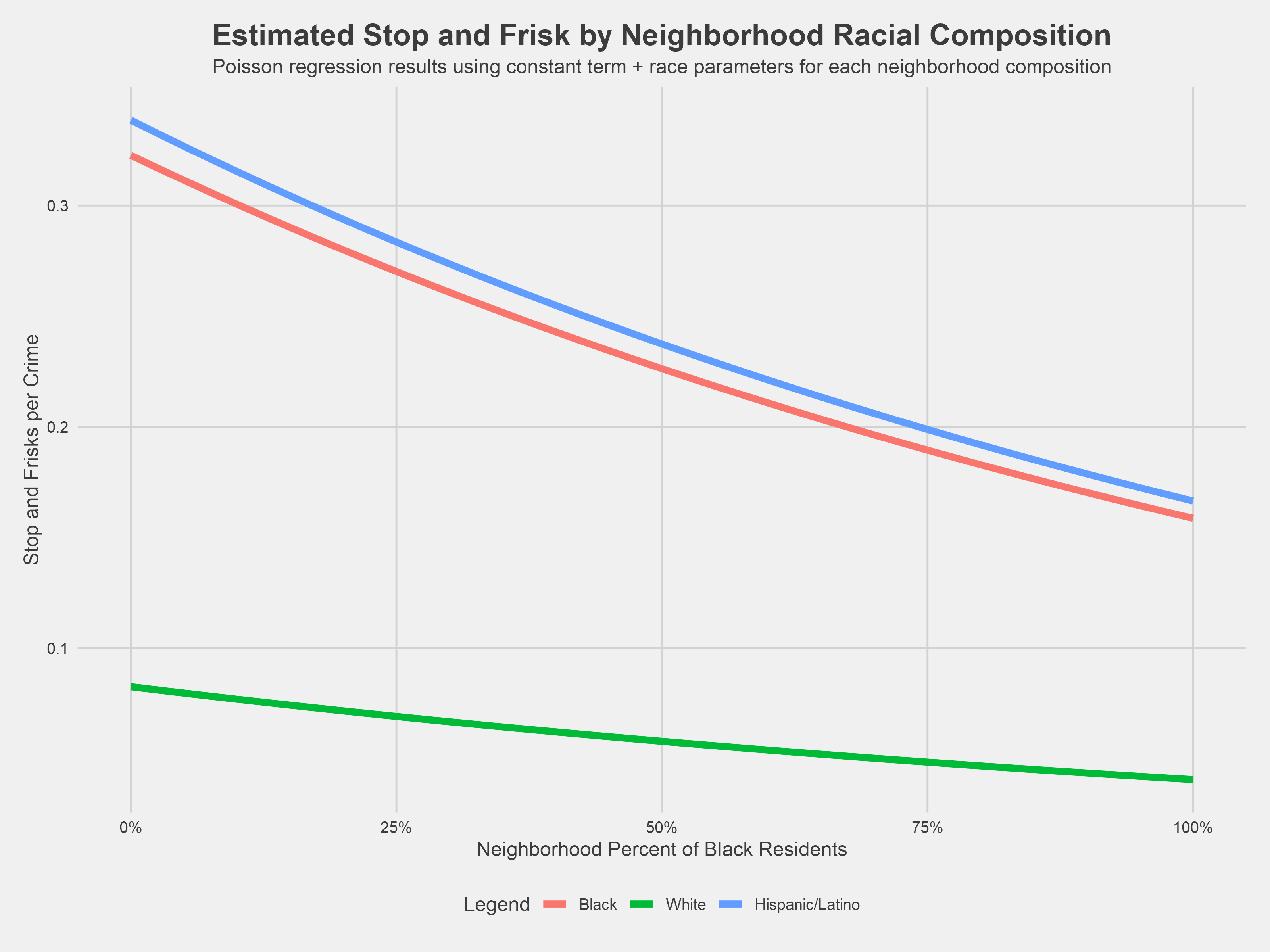
Following in the footsteps of Gelman et al., the chart above shows the number of times a stop was initiated against a member of a racial group per reported crimes committed by a member of that racial group for any neighborhood proportion of black residents. Based on the rates of reported crime and stop and frisk in actual DC neighborhoods, the model estimates that in a hypothetical neighborhood comprised of 25% black residents, a white resident would be stopped 0.07 times for every reported crime committed by a white person while a black resident would be stopped 0.27 times for every reported crime committed by a black resident. In other words, a black resident would be stopped 3.9 times as often per reported crime committed by a black resident then a white resident would be stopped per reported crime committed by a white resident.
Imagine computing this comparison for every possible neighborhood composition. Across all these neighborhoods, a black resident would be stopped on average 3.91 times as often as a white resident per crime committed. Analogously, a Hispanic/Latino resident is stopped an average of 4.10 times more often then a white resident per crime committed. These values, 3.91 and 4.10, are the exponentials of the regression coefficients for “Race: Black” and “Race: Hispanic/Latino” shown in the table above.
So far, this analysis has largely focused on stops of black residents—the vast majority of stops were of black residents, stops were significantly more common in predominantly black neighborhoods, and DC is a historically chocolate city. However, it is striking that this model estimates a similarly high stop/crime ratio for Hispanic/Latino residents as black residents. Looking closer at the data, the high rate seen for Hispanic/Latino residents in this model can be explained by their comparatively low reported crime rate as a racial group relative to their rate of stop and frisks.
While the previous models illustrated that stop and frisk is generally concentrated in neighborhoods with higher proportions of black residents, this model shows that the ratio of stop and frisk to reported crime is higher in whiter neighborhoods among black and Hispanic/Latino residents because of a lower reported crime rate coupled with a relatively higher number of stop and frisks.
Conclusion
The availability of stop and frisk data in DC provides a unique and thought-provoking opportunity to examine how different areas of the city experience policing. This research found, consistent with other research, racial inequity and disproportionality in who was stopped and frisked in DC.
This finding is not surprising; likely the first thing that any casual observer of this data would notice is that over 80% of the MPD’s 28,000 forcible stops involved black residents. It’s also notable that nearly 1 in 5 of the black residents stopped were juveniles and 9 in 10 were male. Beyond these descriptive statistics, modeling indicated that more residents were stopped in predominantly black neighborhoods when controlling for reported crime, but the number of stops per reported crime is highest in neighborhoods with the lowest proportion of black residents. On average, the ratio between stops and reported crimes was nearly four times higher for black and Hispanic/Latino residents then for white residents.
This is not a practice that’s waning, like the NYPD’s stop and frisk program, or even one that is static. Rather, the MPD has steadily increased the frequency of these stops, particularly in mixed race neighborhoods, while failing to comply with a law requiring them to collect and release data about, among other things, the legal basis for the stops.
If you want to see the NEAR Act fully implemented or want to learn more about the MPD’s usage of forcible stops, consider supporting Black Lives Matter DC, Stop Police Terror Project DC, and the American Civil Liberties Union of the District of Columbia in their legal fight to deepen the available MPD stop and frisk data.
All of the code used for this project can be found here and here.
Thanks
Thank you to Caroline Chen, Nicole McAllister, Nick Beaudoin, and David Margolis for providing critical insights and perspectives that helped shape and hone this research.
Thank you also to the DC Metropolitan Police Department for making the stop and frisk data used in this analysis readily available and accessible. We hope that you find the resources and labor necessary to collect and release the remaining data fields required by law. Thank you also to the DC Office of the Chief Technology Officer for making all of the geographical data used here accessible through the DC OpenData Portal.
Appendix: Forcible vs. Non-Forcible Incidents
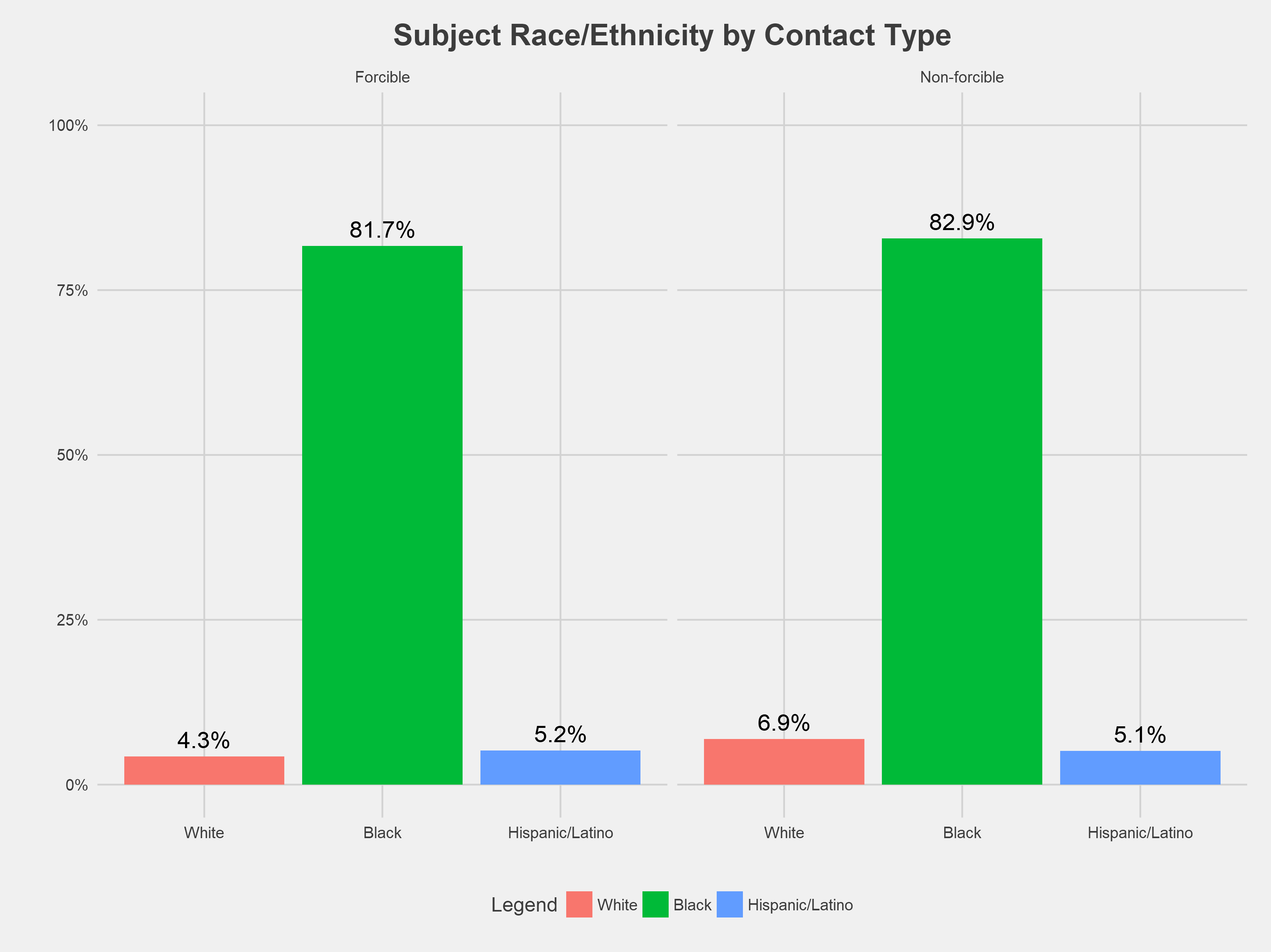
Overall, there is little difference in contact type by race. Around 80% of both non-forcible and forcible involved black residents; however, a slightly greater proportion (2.6%) of non-forcible stops involved white residents (though the total number of forcible stops in general is much higher than the non-forcible stops).
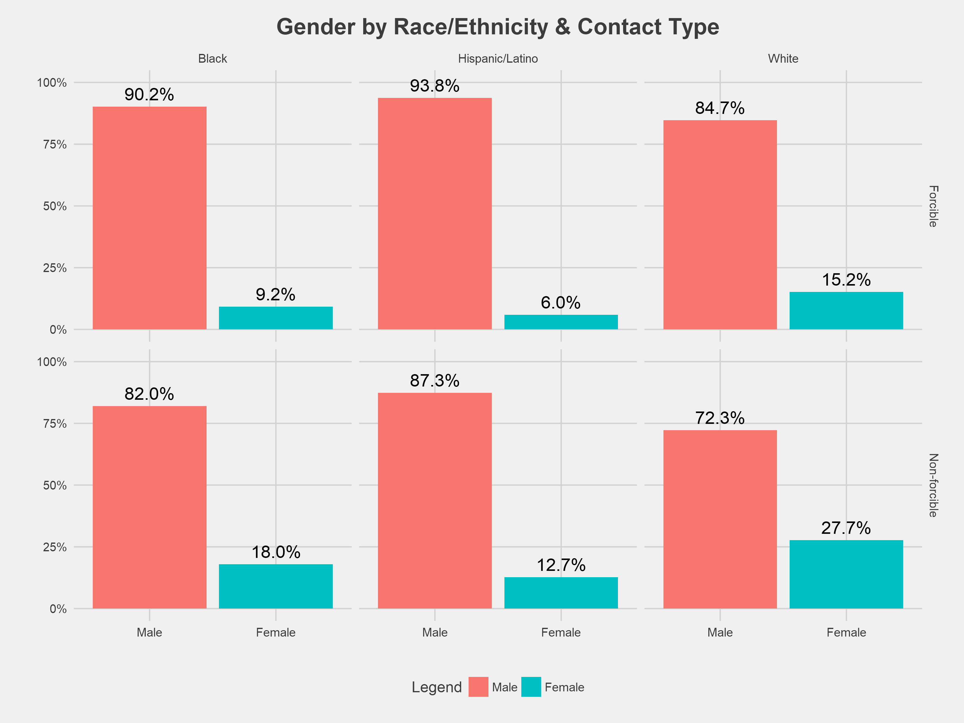
Across all racial groups and stop types, people identified by MPD as male comprise a majority of incidents. However, there are some notable gender differences by contact type. Overall, women, especially white women, made up a greater proportion of non-forcible than forcible contact with the police.
Unlike the forcible stop and frisk incidents, the field contact incident data contains a record of what led to the contact, along with the standard demographics.
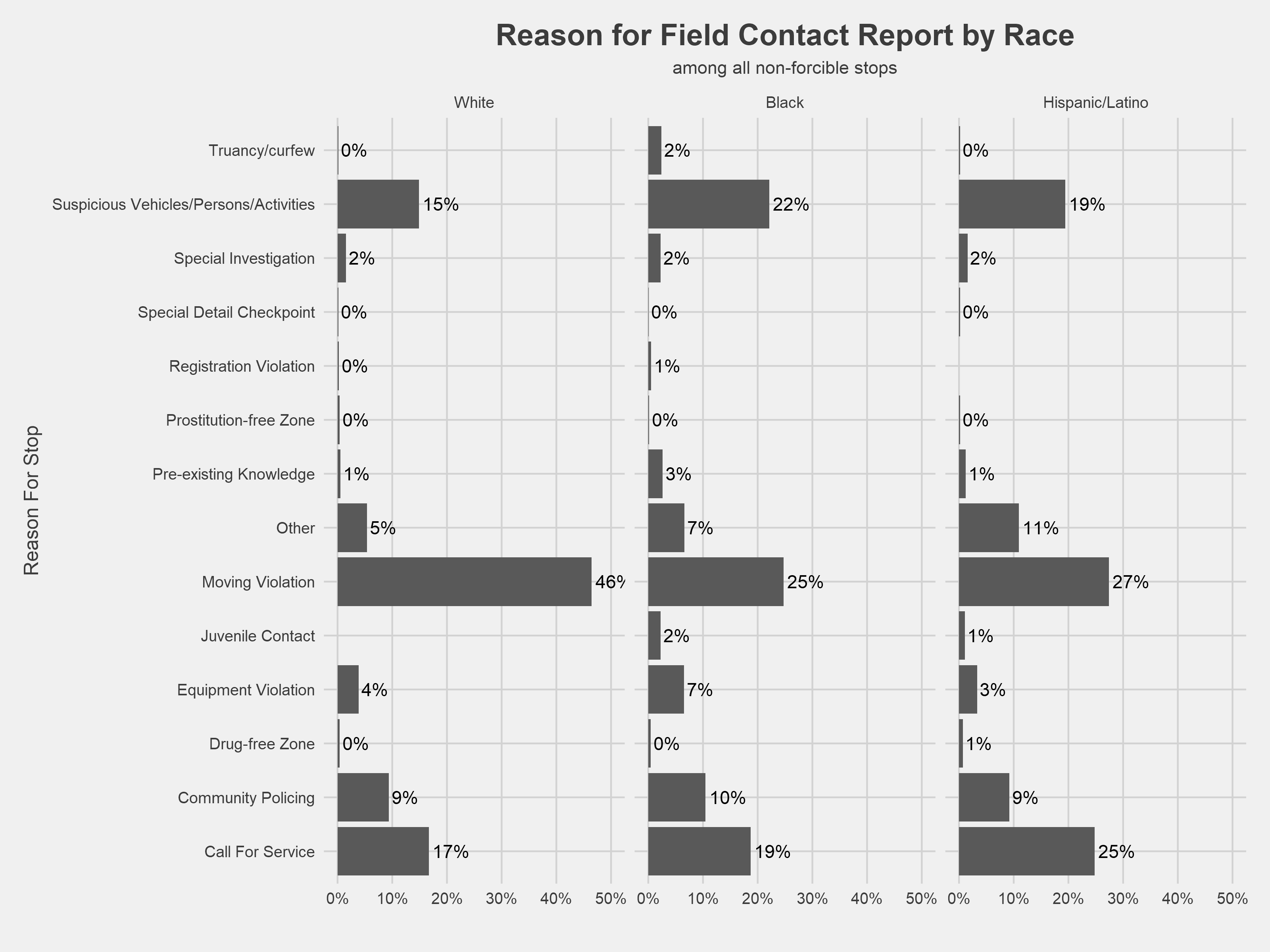
Keeping the important difference between forcible and non-forcible stops in mind, we see that moving violations were the catalyst for nearly half of the non-forcible encounters among whites, while non-forcible stops of black and Hispanic/Latino residents were initiated more frequently for “Suspicious Vehicles/Persons/Activities” and “Call for Service” (or, someone calling the police).
Appendix: Raw Neighborhood Counts
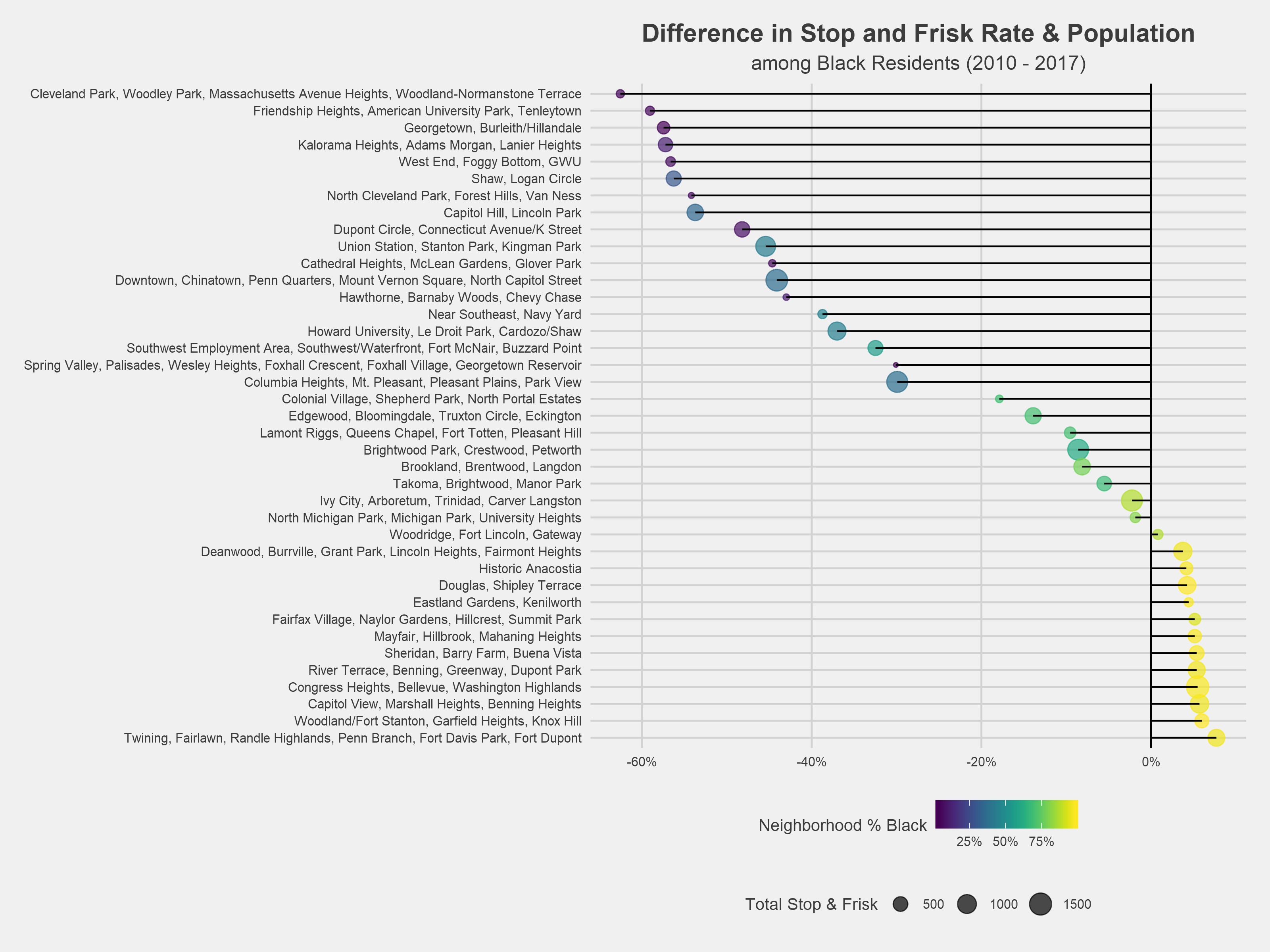
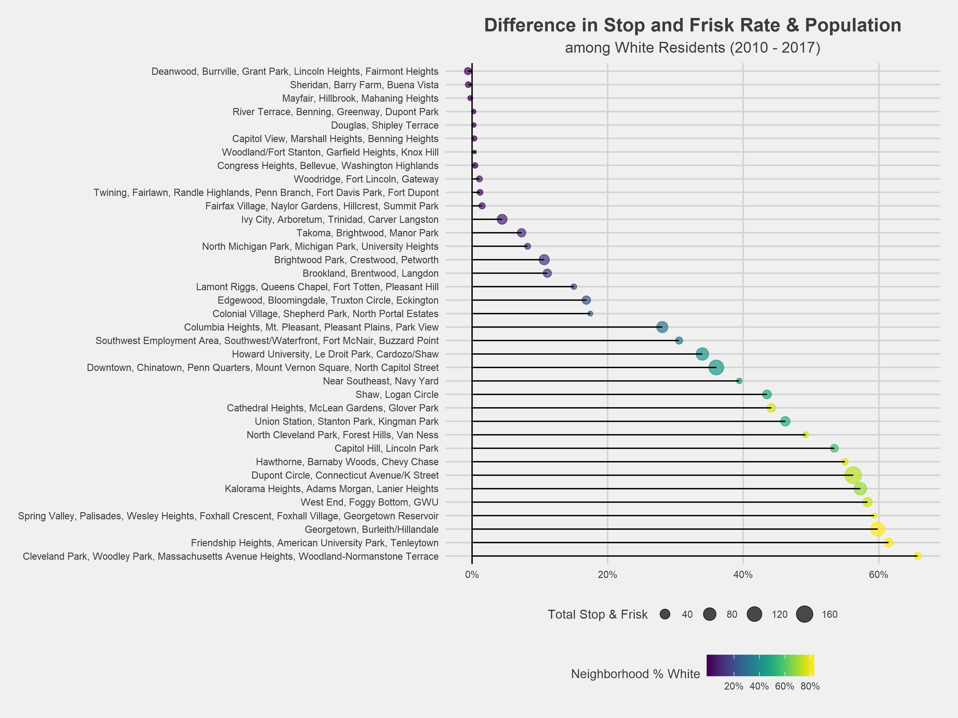
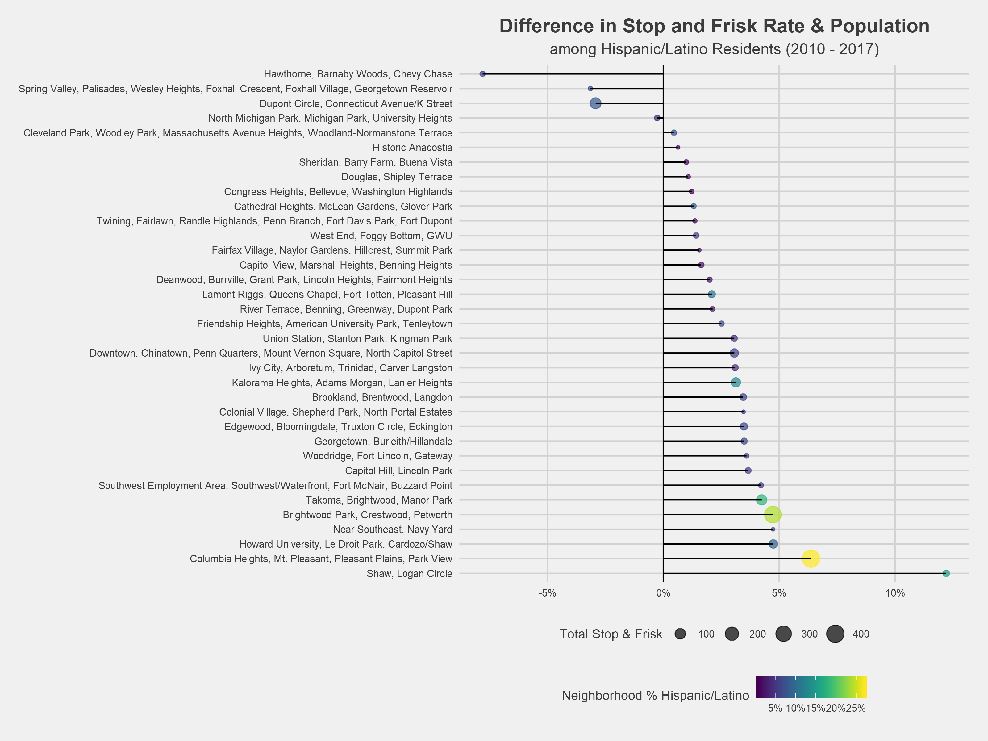
These charts show the difference between the population and stop and frisk rates across race. The raw data can be explored here.
Footnotes
^1. The MPD generally reports locations of stop and frisk incidents as a block (e.g. 4200 BLOCK OF 7TH STREET SE) or a corner (e.g. ‘46TH STREET NE / CENTRAL AVENUE NE’). The MPD did not validate these inputs, so there is significant variance in the way that the street is recorded (e.g. North Capitol Street might be recorded as ‘N CAP’, ‘NORTH CAPITAL STREET NW’, or ‘N CAPITOL ST’). This project utilized several iterative regular expression replacements to fix these inconsistencies.
This project utilized DC Open Data’s block centroid dataset to geocode incidents for consistency with other municipal data products. The block centroid dataset contains coordinates for every block in the city, the block’s street and street number range, and the streets bookending the block. Cleaned stop and frisk incident locations were divided into either block or corner patterns. Block patterns were matched to the block street and fuzzy matched to the block street number endpoints. For corner patterns, one street of the corner was matched to the block street and the other street was matched to the bookending street. The first centroid matching this criteria in the dataset was used. There are a few ambiguous corners in DC. Florida Avenue intersects each of the lettered streets north of R Street twice in the Northwest quadrant, and Rhode Island Avenue and Brentwood Road intersect twice in the Northeast quadrant. These ambiguities account for around a dozen of the nearly 39,000 incidents and were again matched to the first corner in the dataset.
Finally, the city’s block dataset (retrieved March 21, 2018) appears to omit the 400 Block of 2nd Street NW. Incidents on this block were hardcoded to (38.895455, -77.013668).
^2. Bins were chosen to contain similar numbers of neighborhoods and to situate boundaries at natural gaps in the dataset. Specific assignment is shown in the figure below.
^3. Implementation of the crime-only model in R:
R
yearly_model <- lm(formula = avg_sf ~ avg_prev_yr_crime,
   data = nbh_sf_avg)
^4. Despite having lower levels of reported crime than some other neighborhoods, the neighborhoods with the highest concentration of black residents have comparatively much higher rates of stop and frisk. This reflects the trend that neighborhoods with higher proportions of black residents tend to have lower populations but higher levels of stop and frisk per capita.
^5. Implementation of the crime and race model in R:
R
yearly_model_w_race <- lm(formula = avg_sf ~ avg_prev_yr_crime + coll_bins,
                   data = nbh_sf_avg)
^6. Similarly to how we looked at stop and frisk as it compares to neighborhood racial composition, the chart below compares stop and frisk rates to neighborhood reported crime rates for that racial group. Each dot represents a racial group in a given neighborhood. If a dot is below the diagonal line, then that group is stopped at a higher rate relative to their reported crime rate in that neighborhood, and vice versa.
Certain neighborhoods contain high proportions of crimes with unclassified or unreported racial demographics; these crimes were marked as “Unknown” and removed from analysis. The effect can be seen below for the example points labeled below: the proportion of crime committed by black, white and Hispanic/Latino residents should sum to nearly 100%, but they actually add up to 70%. Columbia Heights is among the most extreme examples of this phenomenon, but predominately black neighborhoods generally have a greater proportion of unknowns. This is a natural limitation of the data provided to and collected by the MPD, and it is difficult to measure what impact this has on the analysis. As a result of this, certain neighborhoods in the chart above will not add up to 100%.
^7. Implementation of the Poisson model in R:
R
stop_model <- glm(stop_frisks ~ race_ethn + nbh_black_bins, family=quasipoisson,
                  offset=log(prev_yr_crimes), data = stops_crimes_nbh,subset=prev_yr_crime>0 & stop_frisks>0)
Licensing

This work is licensed under a Creative Commons Attribution 4.0 International License.